 by
by BI Dashboard Design for UK SMEs: Layout, Hierarchy, and Drill-Downs
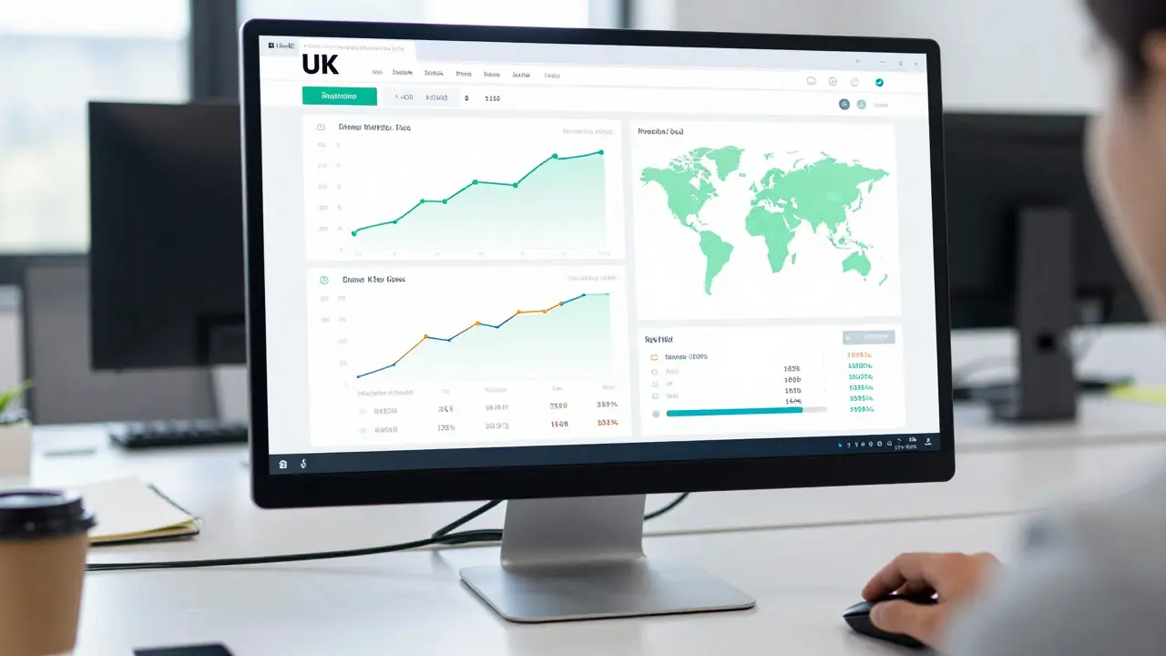
20 Aug, 2026Most small business owners in the UK stare at a wall of numbers every morning and still don't know if they're making money. The problem isn't the data; it's how that data is presented. A cluttered spreadsheet or a dashboard with 40 charts doesn't help you make decisions-it just creates anxiety. If you run a small-to-medium enterprise (SME) in the UK, your time is too valuable to waste deciphering confusing visuals. You need a BI dashboard design that tells you exactly what's happening, why it's happening, and what to do next.
Good dashboard design isn't about making things look pretty. It's about cognitive efficiency. Your brain processes visual patterns faster than text, but only if those patterns are logical. When we talk about layout, hierarchy, and drill-downs, we are talking about guiding the user's eye from the "big picture" to the "specific detail" without forcing them to hunt for information. This guide breaks down how to structure these elements specifically for UK market contexts, including VAT considerations and regional performance tracking.
Why Standard Templates Fail UK SMEs
Many off-the-shelf Business Intelligence (BI) tools come with default templates that assume a large corporate structure. They often prioritize global metrics or complex financial ratios that a local retailer or service provider doesn't use daily. For a UK SME, the context is different. You operate under specific regulatory frameworks, such as HMRC requirements, and you likely serve distinct geographic regions like London, Manchester, or Birmingham, each with different economic drivers.
A generic dashboard might show you "Total Revenue," but it won't separate out VAT correctly or highlight seasonal spikes relevant to British holidays like Boxing Day or Easter. If your dashboard doesn't speak your language-both literally and financially-it becomes noise. The first step in effective design is stripping away everything that doesn't directly impact your weekly or monthly operational decisions. Ask yourself: if I remove this chart, will I miss a critical alert? If the answer is no, delete it.
Establishing Visual Hierarchy: The F-Pattern Approach
Human eyes don't scan screens randomly. Research on web usability shows that users typically read in an "F-pattern": they scan across the top, then slightly lower, and finally down the left side. Your dashboard should respect this natural behavior. The most critical metric-the one that keeps you up at night-should sit in the top-left corner. This is usually a Key Performance Indicator (KPI) like Cash Flow or Gross Margin.
Below that, place secondary metrics that provide context. For example, if your top metric is Sales, the row below it might contain Units Sold, Average Order Value, and Return Rate. These support the main number but aren't the headline. By using font size, color intensity, and spatial proximity, you create a clear hierarchy. Large, bold numbers draw attention first. Smaller, muted text provides supporting details. This reduces cognitive load, allowing you to grasp the health of your business in under five seconds.
| Position | Content Type | Example for UK Retailer | Visual Style |
|---|---|---|---|
| Top Left (Primary) | Critical KPI | Net Profit After VAT | Largest font, high contrast |
| Top Right (Secondary) | Trend Indicator | Month-over-Month Growth % | Medium font, green/red arrows |
| Left Column (Tertiary) | Operational Metrics | Daily Footfall / Website Sessions | Smaller font, line charts |
| Bottom Section (Detail) | Drill-Down Data | Sales by Postcode Region | Interactive table/map |
Designing Effective Drill-Downs for Actionable Insights
A static number is useless if you can't find out why it changed. This is where drill-down functionality comes in. In BI terms, a drill-down allows you to click on a summary figure to reveal the underlying granular data. However, not all drill-downs are created equal. Poorly designed drill-downs lead to "analysis paralysis," where you spend more time navigating menus than analyzing data.
For UK SMEs, the most valuable drill-down paths usually follow three specific trajectories:
- Geographic Drill-Down: Start with national sales, then break it down by region (North, South, Midlands), and finally by individual store or postcode area. This helps identify if a slump is localized or systemic.
- Product/Service Drill-Down: Move from total revenue to category performance, then to specific SKU (Stock Keeping Unit) levels. This reveals which products are driving profit versus which are just generating volume.
- Time-Based Drill-Down: Zoom from annual trends to quarterly, monthly, and even hourly views. This is crucial for identifying peak trading times, such as lunch rushes for hospitality businesses or weekend spikes for retail.
The key rule here is consistency. The path from summary to detail should be intuitive. If you click on "Sales," the next screen should logically show "Sales by Product" or "Sales by Location," not a random list of expenses. Limit the depth of your drill-downs to three levels maximum. Beyond that, the data becomes too granular for strategic decision-making and better suited for raw database queries.

Layout Best Practices: White Space and Color Coding
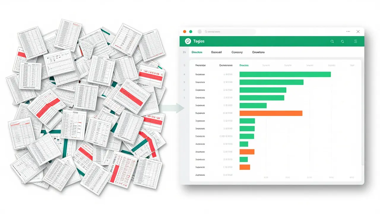
One of the biggest mistakes in dashboard design is overcrowding. White space is not wasted space; it is a functional tool that separates related groups of data. Group your charts logically. Put all financial metrics together, all customer metrics together, and all operational metrics together. Use subtle borders or background shading to define these zones.
Color coding must be consistent and meaningful. In the UK business context, red almost universally signals a negative trend or a budget overrun, while green indicates positive growth or staying within budget. Avoid using too many colors. Stick to a palette of three to four primary colors. Use blue for neutral data points, orange for warnings, and red/green for status indicators. If you use heat maps for geographic data, ensure the gradient is easy to distinguish, especially for users who may have color vision deficiencies. Always include a legend, but keep it unobtrusive.
Integrating Benchmarking Metrics for Context
Knowing your own numbers is good; knowing how you compare to others is better. Benchmarking metrics provide the context needed to interpret your KPIs. For a UK SME, comparing your performance against industry averages or competitor estimates helps set realistic goals. However, finding reliable public benchmark data for small businesses can be challenging.
You can implement internal benchmarking by comparing current performance against historical bests. For external benchmarking, integrate data from trade associations or industry reports. For example, a software agency in Leeds might benchmark its Client Retention Rate against the average reported by the BCS (British Computer Society). Display these benchmarks as reference lines on your charts. If your line dips below the industry average, it’s a clear signal to investigate. This transforms your dashboard from a record-keeping tool into a strategic compass.
Common Pitfalls to Avoid in UK SME Dashboards
Even with good intentions, dashboards can fail. Here are the most common traps that UK business owners fall into:
- VAT Confusion: Ensure all revenue figures are clearly labeled as either Gross (including VAT) or Net (excluding VAT). Mixing these up leads to significant margin calculation errors. Always default to Net for profitability analysis, as VAT is a liability, not income.
- Data Latency: Real-time is great, but sometimes daily updates are sufficient and cheaper. Clarify the data refresh rate. If your dashboard says "Today" but the data is from yesterday, trust erodes quickly.
- Mobile Unfriendliness: Many SME owners check their dashboards on phones while on the go. Ensure your layout collapses gracefully on smaller screens. Prioritize the top two KPIs for mobile views and hide complex tables behind tabs or scrollable areas.
- Lack of Alerts: A dashboard you have to manually open is a passive tool. Set up automated alerts for critical thresholds, such as cash flow dropping below £5,000 or inventory hitting zero stock levels.
Implementation Steps for Your Team
Building a new dashboard doesn't have to be a months-long project. You can iterate quickly. Start by defining your top three questions. What do you need to know every morning? List them. Then, map those questions to specific data sources. Finally, prototype the layout on paper before touching any software. Sketch the boxes. Decide where the big numbers go. Test the hierarchy with a colleague who isn't involved in the day-to-day operations. If they can understand the story in 30 seconds, you've succeeded.
Remember, the goal of Business Intelligence is the process of transforming raw data into actionable insights to drive better business decisions. It is not about collecting data for the sake of collection. Keep it simple, keep it relevant, and keep it actionable. As your business grows, so should your dashboard. But never let complexity outpace clarity.
What is the ideal number of KPIs on a single dashboard page?
Aim for no more than 5-7 Key Performance Indicators per view. More than this overwhelms the user and dilutes focus. If you need to track more metrics, use multiple tabs or pages dedicated to specific departments like Finance or Sales.
How often should I update my BI dashboard data?
It depends on the metric. Financial metrics like cash flow can be updated daily or weekly. Operational metrics like website traffic or inventory levels benefit from real-time or hourly updates. Match the frequency to the decision speed required.
Do I need expensive software to create a professional dashboard?
No. While platforms like Tableau or Power BI offer advanced features, many UK SMEs achieve excellent results with integrated tools from their existing accounting software (like Xero or QuickBooks) or affordable BI add-ons. The design principles matter more than the price tag of the software.
What is the difference between a report and a dashboard?
A report is typically static, detailed, and used for deep-dive analysis after the fact. A dashboard is dynamic, high-level, and designed for monitoring current status and spotting anomalies in near-real-time. Reports answer "what happened?" while dashboards answer "what is happening now?"
How do I handle missing data in my visualizations?
Never leave gaps unexplained. Use labels like "N/A" or "Pending" rather than blank spaces, which users might mistake for zero. If data is delayed, display a timestamp indicating when the last successful sync occurred to maintain transparency.